Lighting service Lumos
- Branding
- Content Creation
- Search Engine Optimization (SEO)
- Standard Websites
- Upgrade & Maintenance
- Website Design
- Website Development
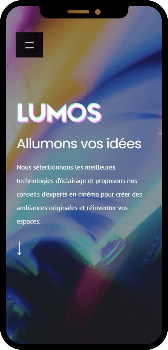
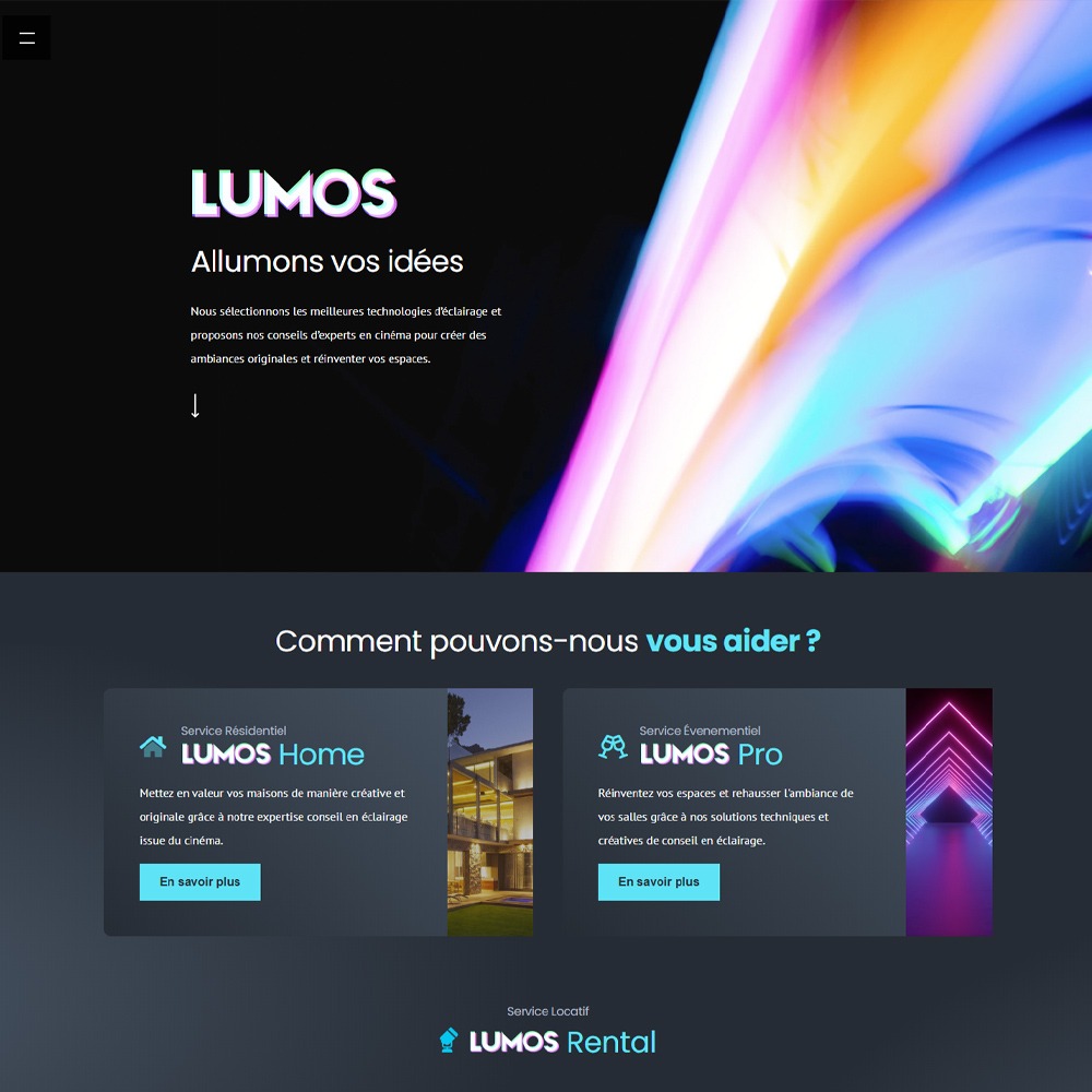


 Lumos is a Montreal based company, catering to a broad Quebec audience with light installation services and the rental of lights and lighting equipment.
Their services fall under three separate categories:
• Rental solution: to rent high end lighting equipment
• Residential services: Selection and installation of high end lighting for your home
• Event services: Selection and installation of high end lighting for events, restaurants and offices
Their website highlights the scope of work they can provide, the quality of their equipment and their expertise in the lighting industry.
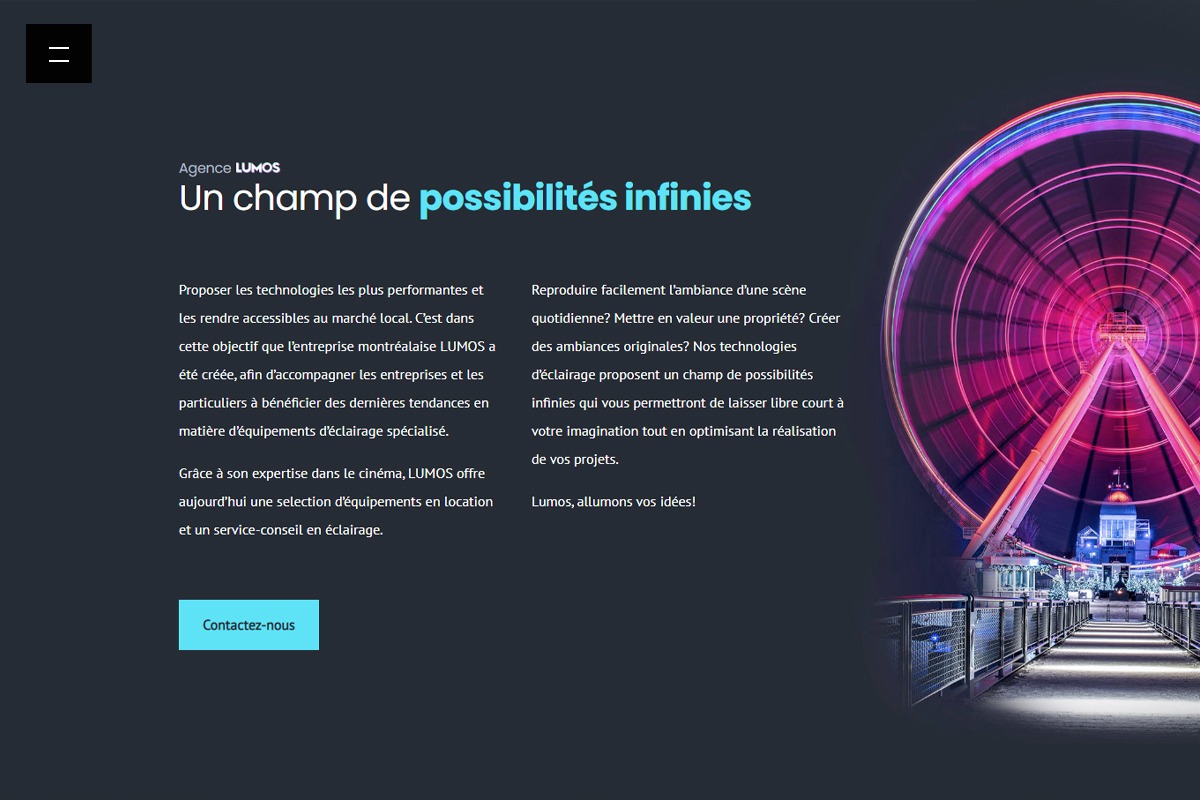
Starting in the Fall of 2019, we started working with Lumos to create a new brand identity as well as a brand new website which catered to their different audiences. We implemented impactful visuals, a streamlined navigation and a modern brand identity to help in that context.
Obviously, the website needed to feature the various services offered by Lumos in the clearest of ways, while being easy to navigate. Regarding rentals, the website needed to enable users to complete a quote request, by selecting the relevant parameters themselves.
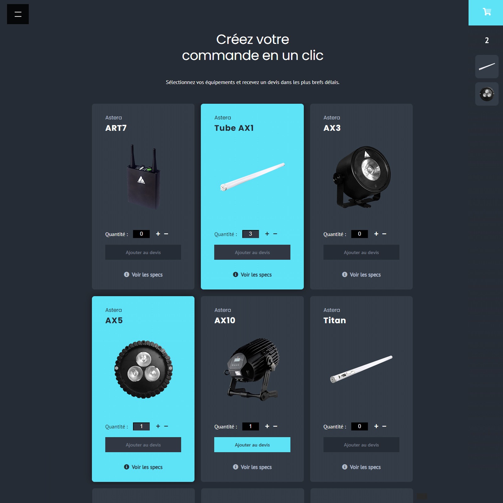
Finally, the website needed to showcase the various products in a catalogue format, allowing the users to browse relevant information, specs and visuals for each light and accessory.
As usual, the website needed to be easily managed by Lumos, so they could have complete control over their online presence.
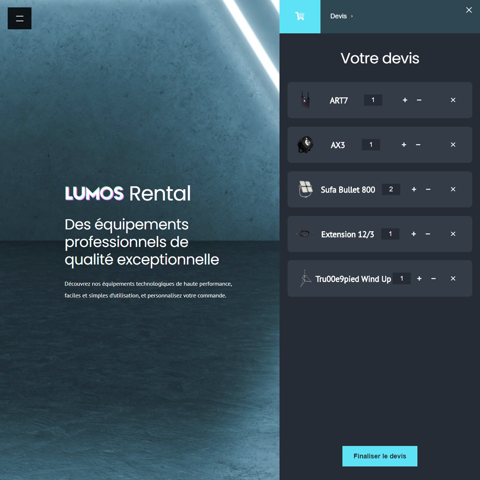
First, it was vital to complete an in depth analysis of Lumos' market, competitors and industry standards. Once completed, we could move onto the actual launch of the website production mandate. Divided in three separate sprints, the process goes as follows: Design and branding of the new website, development and production of the website based on approved designs and finally the launch protocol.
We started by producing a brand identity that matched Lumos’ expectations and culture. It needed to be easily identifiable, professional and highlight the quality of their products and services. With the above in mind, we selected a strong color palette, elegant fonts and powerful visuals which allowed for the brand to shine.
Content and page layouts needed to be intuitive, clear and accessible by a broad range of users and demographics. Once designs were final and approved by the client, we could start building the platform.
Next came development. The product catalogue, center piece of this website, needed to be flexible and durable, while allowing for a smooth browsing experience. Product specifications, while exhaustive, needed to be clear and easily digestible.
Once the user browsed the available information, they needed to be able to request a quote for the selected lights, quantities and time needed for the rental.
Smooth transitions and animations underline the lighting experience Lumos offers its clients.
Once built, the website allowed for easy management, modification of images, text and most importantly products. Dynamically connected content allowed for relevant information to be easily displayed, while avoiding the annoying multiple page browsing experience that can clutter certain websites.
Clear conversion funnels were implemented to help Lumos convert on their interested users and provide them with valuable recommendations and support.
Finally, the website was fully optimized for search engines, allowing it to start it’s organic growth on the right foot.
A range of brilliant colours
Color coding was selected based on the overarching Lumos concept. To provide high end lighting solutions and create beautiful atmospheres in the various spaces Lumos caters to. The contrast between the darker backgrounds and the vibrant colors was therefore reused across the site to highlight that reality.
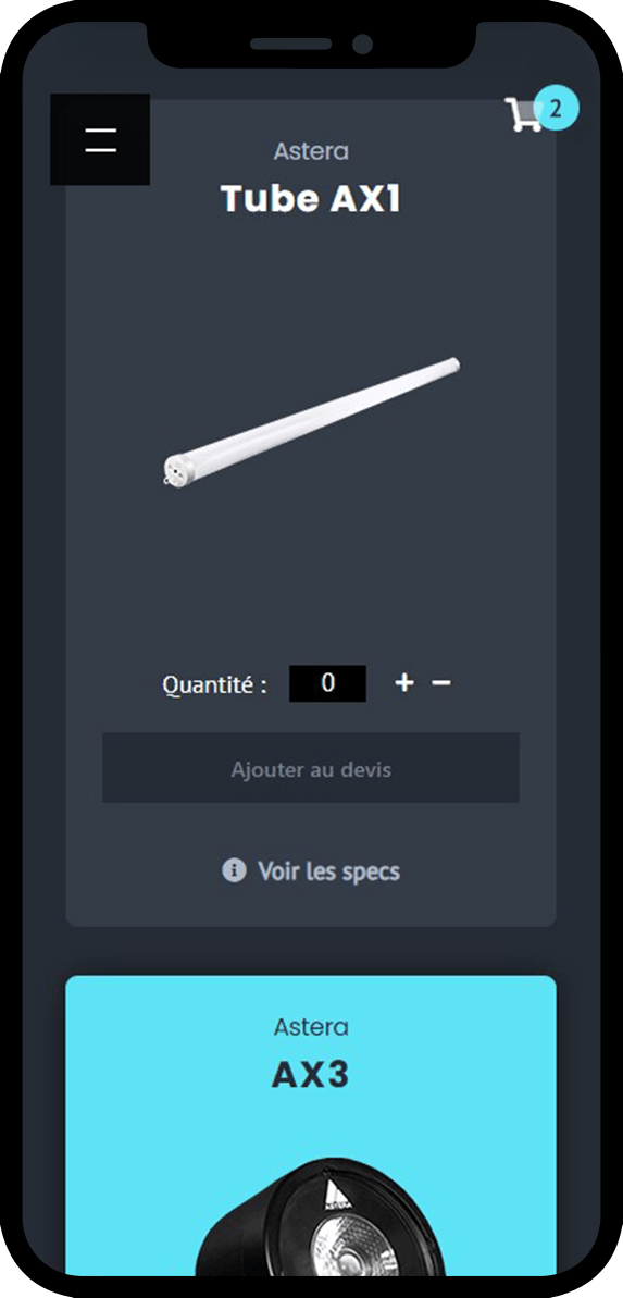
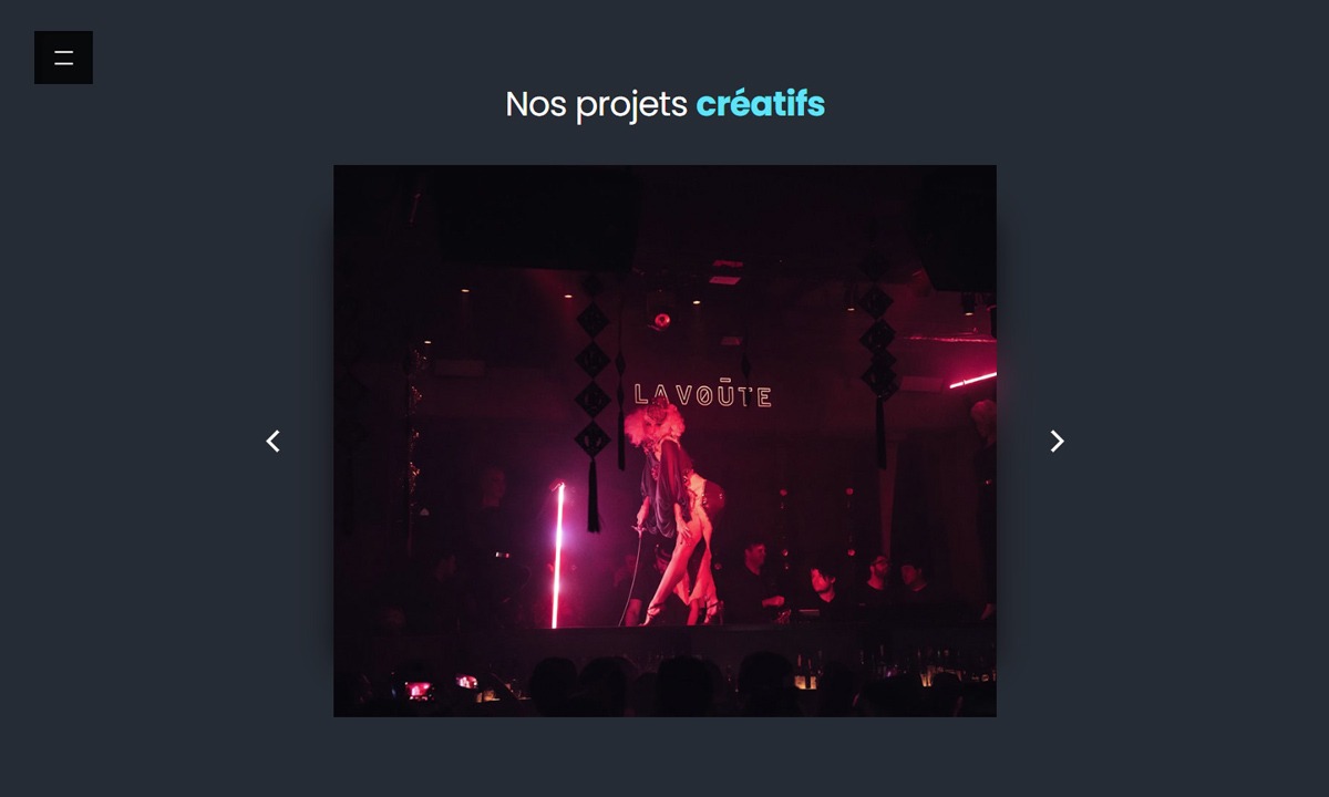
Mobile is the main focus Images were selected based on their appeal and visual impact and helped further the overall identity Lumos projects to their audience.
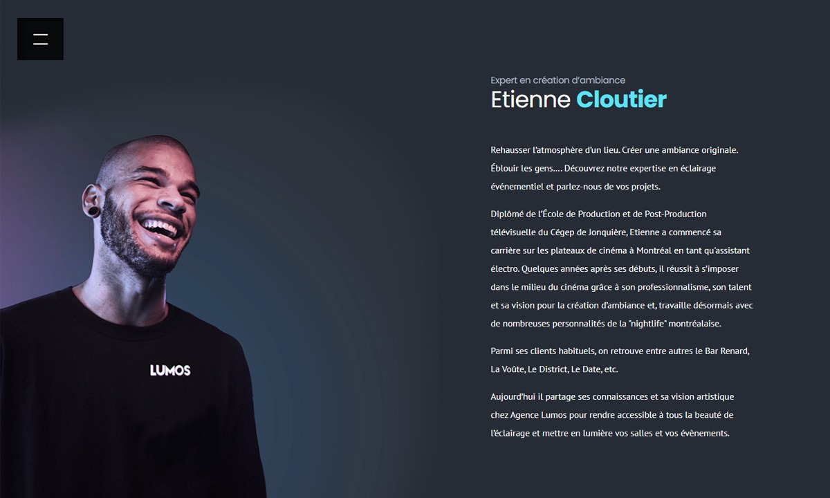
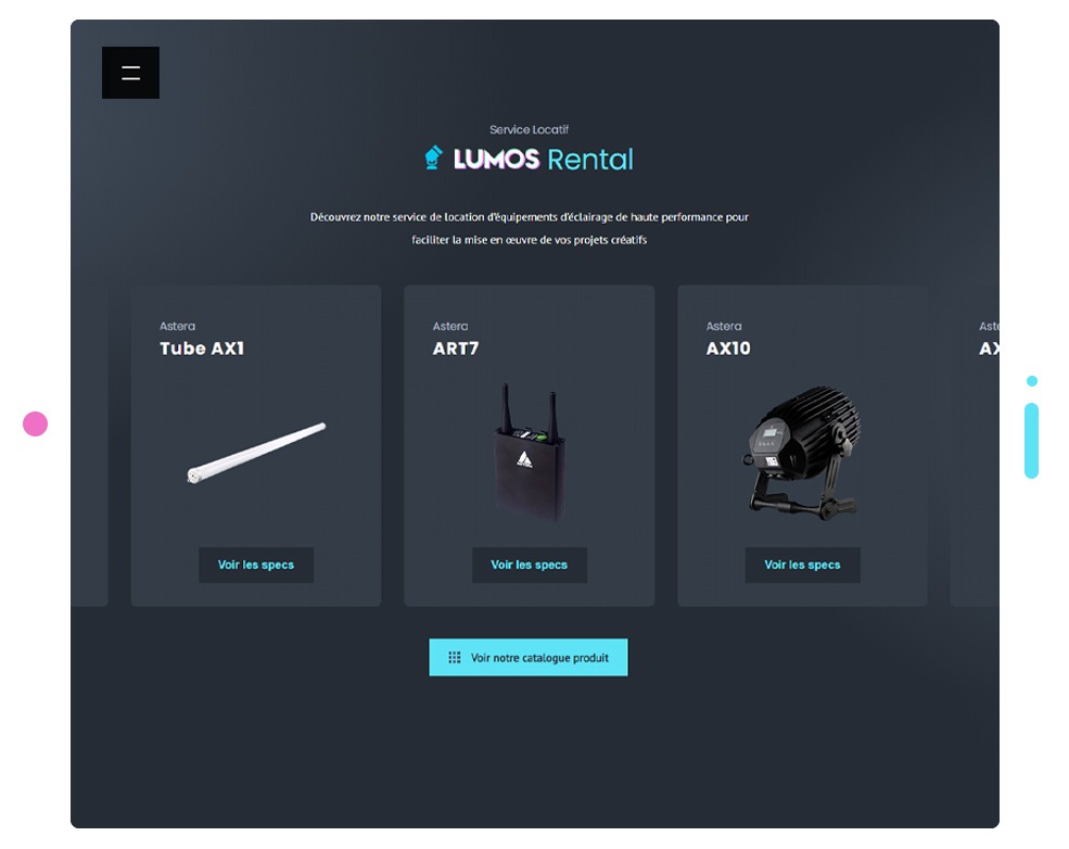
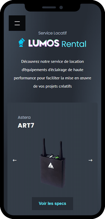
By building an easy to use online catalogue and allowing for quick quotes, we’ve highlighted Lumos’ value proposition in addition to the expertise of their team.
The newest in a family of classy yet eclectic resto-bars in Montreal, Tendresse is a bistro that reflects the diverse tastes of its patrons, both literally and aesthetically. Perched in the middle of the Gay village, it boasts a varied and multi-cultural Vegan menu, often locally sourced, fit for anything from brunch to dinner or coffee to cocktails. In anticipation of its opening, Nara teamed with the bistro for the creation of its website.
View project