Laboratoire Dr renaud
A VISUAL REBIRTH FOR AN ICONIC CANADIAN BRAND
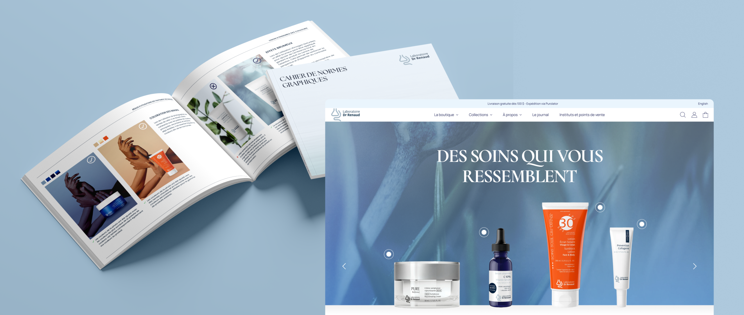
Laboratoire Docteur Renaud is a pioneering Canadian skincare brand, recognized for its scientific expertise and its roots in natural ingredients. The company commissioned Nara Créative to undertake an ambitious rebranding and digital ecosystem overhaul, including the design of a new transactional website and the creation of an extensive suite of visual tools. The objective: to evolve the brand while respecting its heritage, and to offer a modern platform that meets the expectations of its loyal customers.
Unite branding,
experience and performance
The mandate entrusted to Nara aimed to modernize all of the brand’s touchpoints, both on the visual and functional levels. The project had to reconcile a large product catalog, high requirements in terms of imagery, and a fluid purchasing journey.
It was also about creating a universe capable of supporting commercial objectives, while providing internal teams with a set of concrete resources to fuel their communications and marketing actions.
The Objectives
Deploy a modern, high-performance and optimized website to support a fluid, reassuring and efficient user-buyer journey, meeting the expectations of a loyal clientele accustomed to the quality of the products.
Enrich and structure the brand image in order to unify the aesthetics, strengthen visual recognition and clearly position the brand in a high-end and contemporary universe.
Provide internal teams with a complete set of tools and visual resources facilitating the production of marketing, digital and print content, in a consistent and sustainable way.
Solutions
Provided
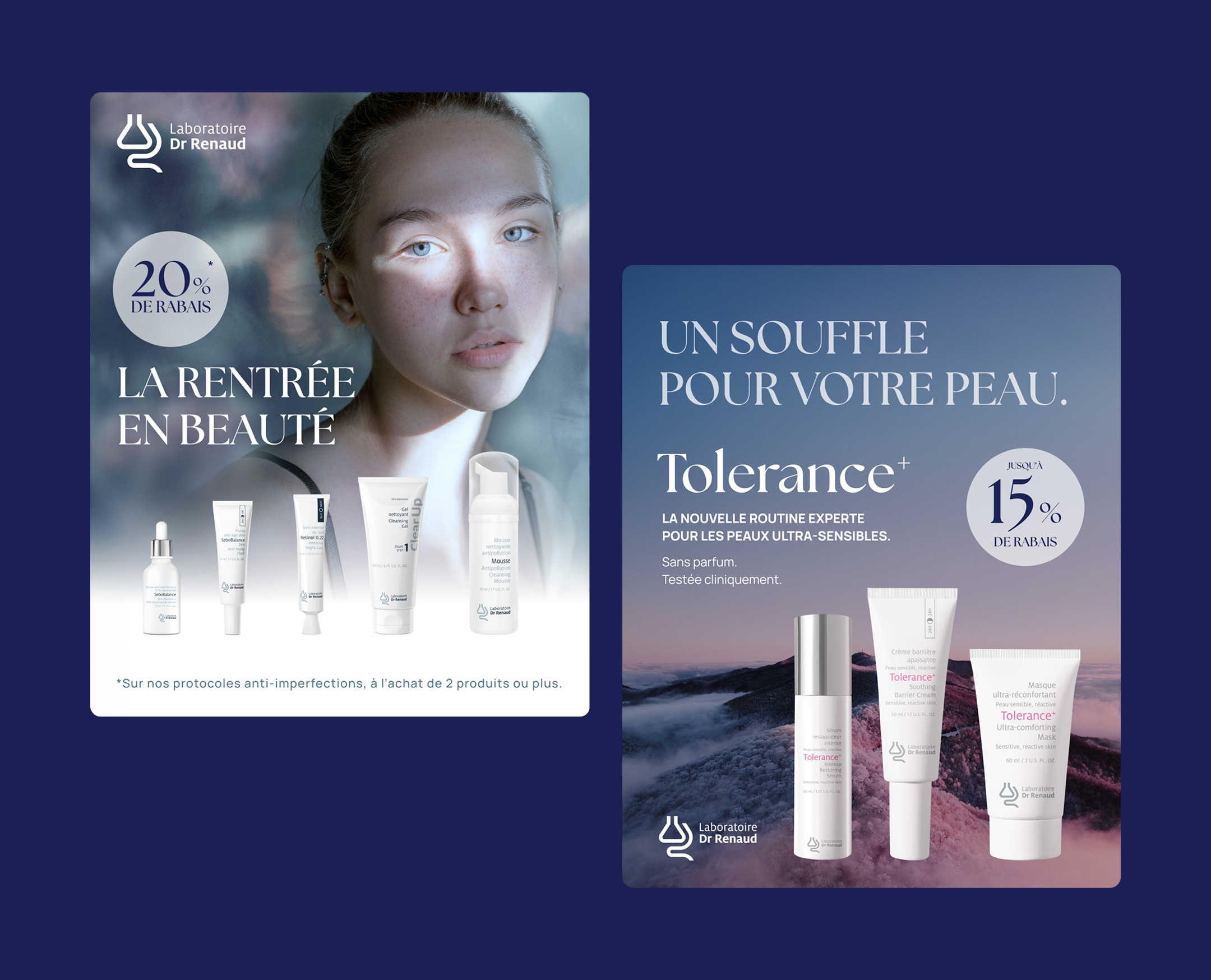
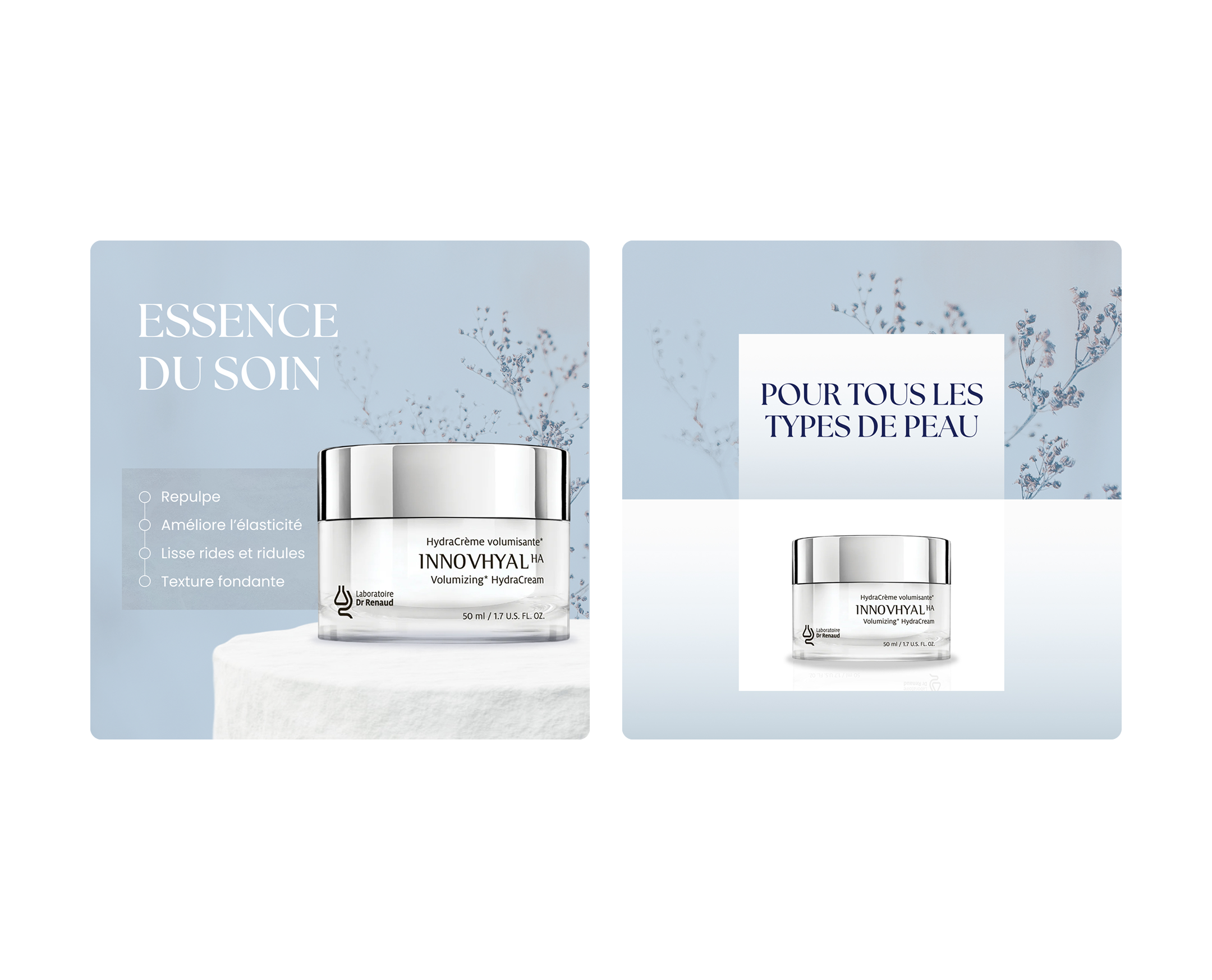
To meet these objectives, Nara deployed a global approach combining art direction, digital design, custom development and asset production. Each solution was thought out to strengthen brand consistency, optimize the user experience and concretely support marketing and commercial activities.
Enrichment of the brand image
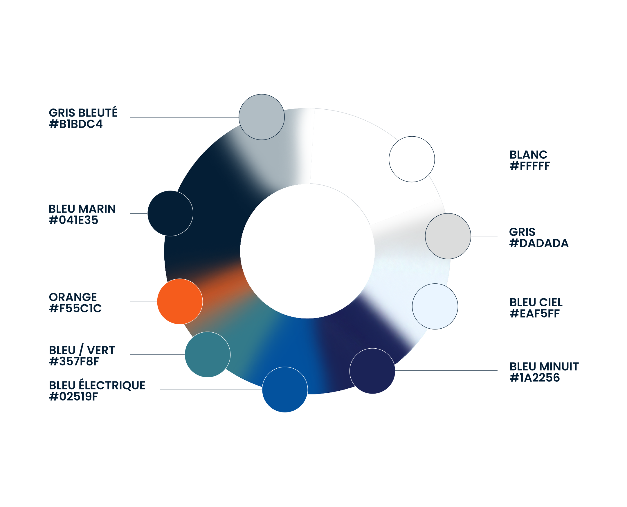
We have refocused and enriched the brand image by capitalizing on existing ingredients, while integrating new graphic elements. A deliberately tightened and structured chromatic spectrum around a color wheel now allows for anchoring the aesthetics in a uniform, consistent and recognizable universe.
Valuing the product experience
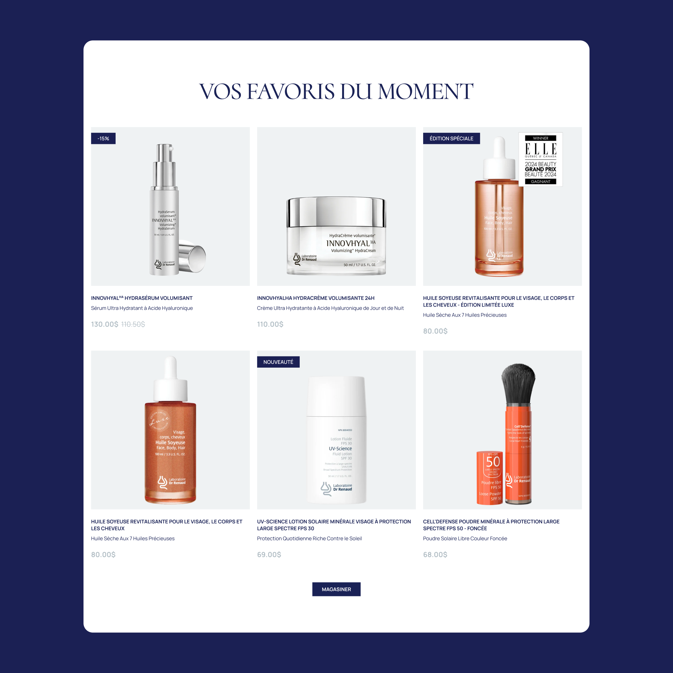
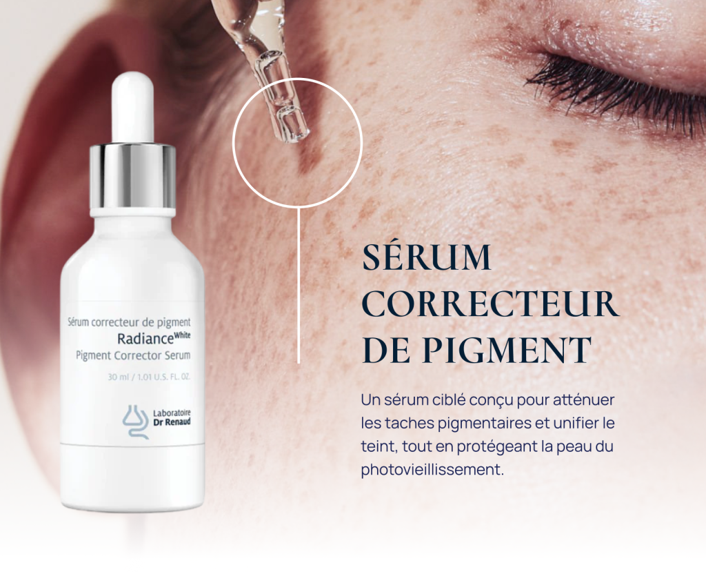
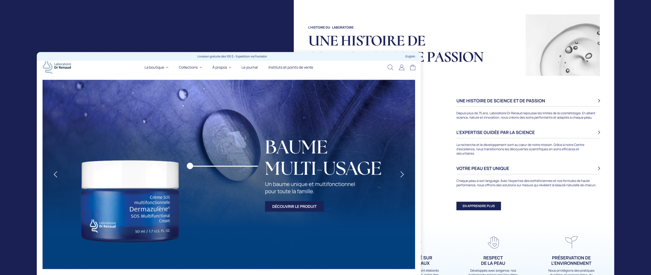
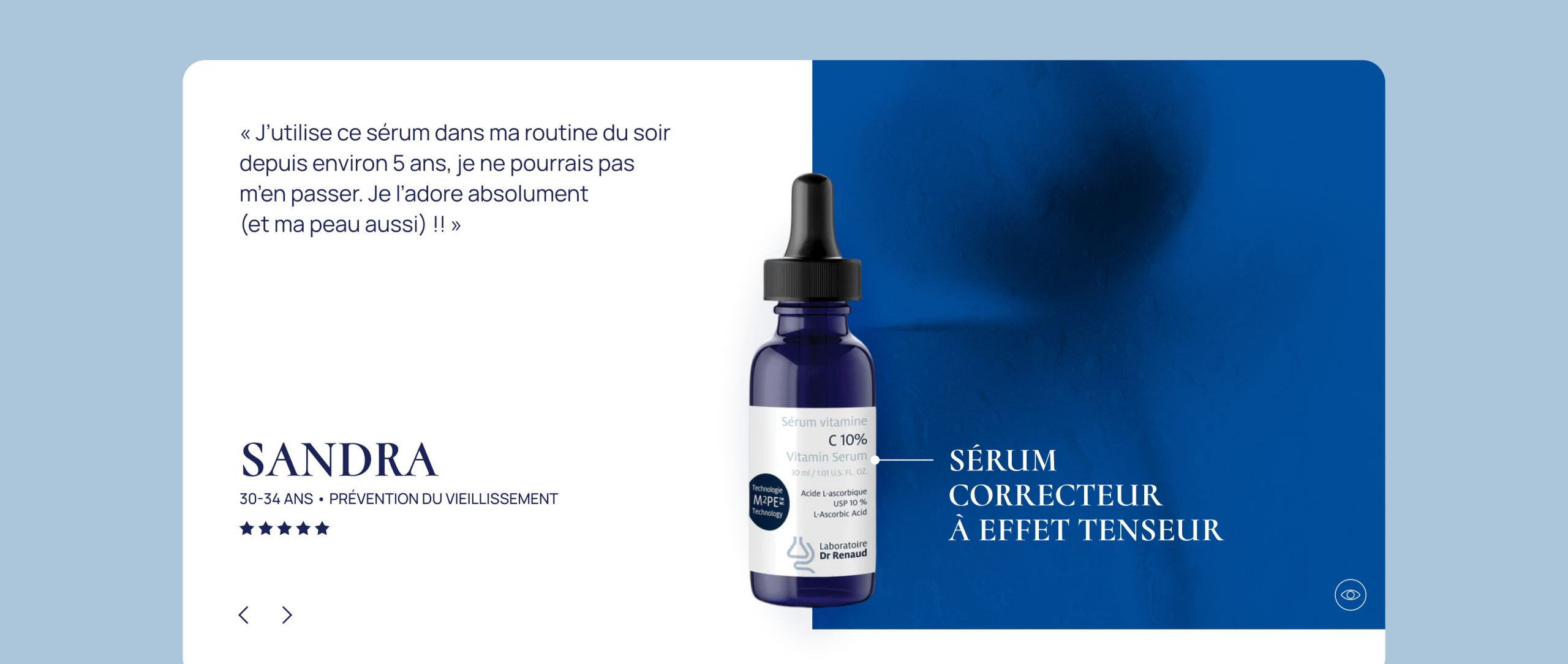
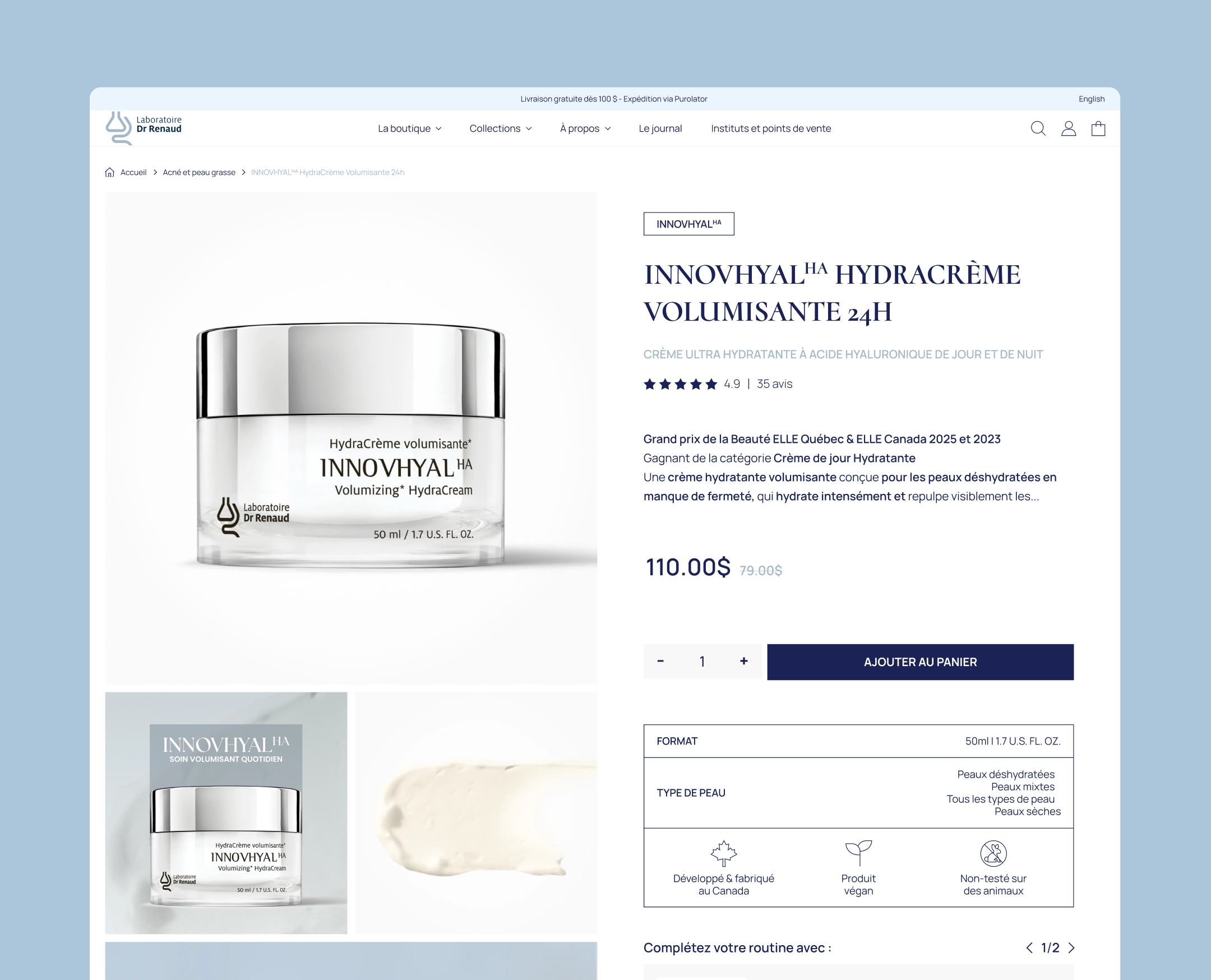
Each product benefits from a detailed presentation including technical information, benefits, ingredients and high-definition visuals. The architecture of the pages and the functionalities put in place favor intuitive navigation, facilitate the discovery of ranges and support a clear and efficient transition to purchase.
Immersive art direction
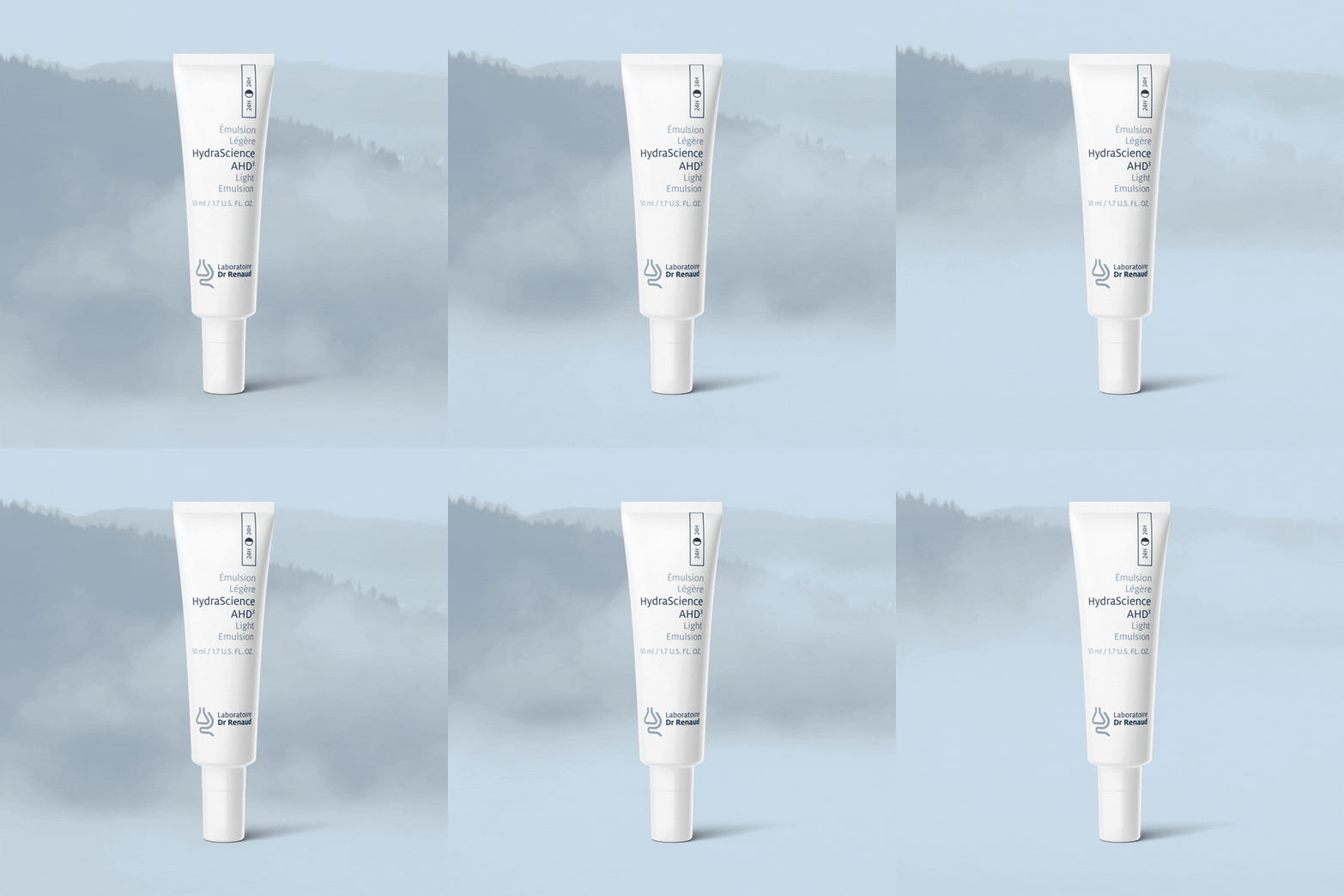
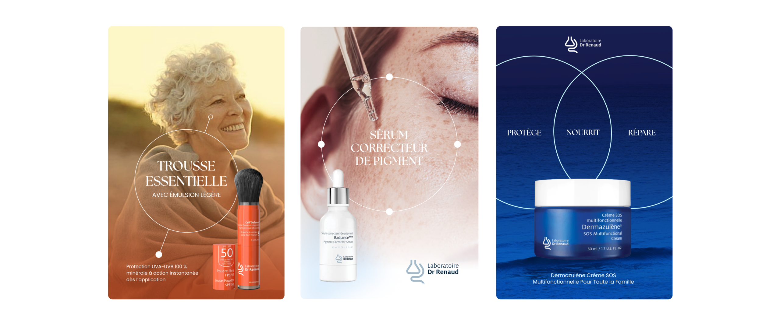
An aquatic, airy and poetic atmosphere was developed in order to transmit the values of well-being, science and naturalness. The entire art direction highlights the high-end positioning of the products and the quality of the formulations.
Creation of reusable assets
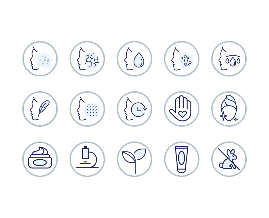
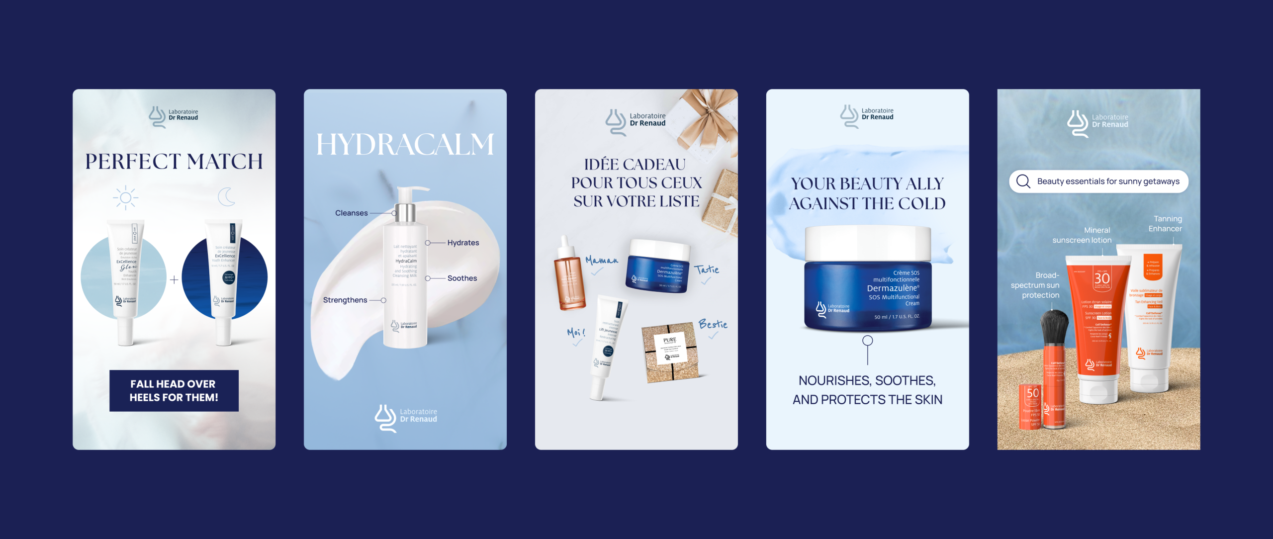
We have produced a library of visual assets and graphic ingredients allowing for the brand to be applied across all of its applications. These elements visually translate the properties, benefits and rituals of use, and directly support the sales process.
Our Results in figures
More than a thousand visuals were designed in order to ensure aesthetic consistency and optimal showcasing of the products across all platforms.
More than a hundred products integrated with complete sheets, optimized visuals and a structure favoring understanding and purchase.
A complete branding kit covering digital, marketing and print applications, serving as a reference for internal teams.