A restaurant where music is part of the experience.

At Zinzin, the atmosphere existed long before the brand identity. A universe inspired by the 60s and 70s, vinyl records displayed on the walls, tables and throughout every detail of the space, a bold energy and a highly distinctive customer experience already defined the restaurant.

However, the restaurant wanted to give this universe a clearer structure in order to strengthen its positioning, particularly around its catering services, and professionalize its communication tools. Our mandate was therefore to capture what made Zinzin unique and translate it into a strong, recognizable and easily deployable visual identity.
Turning an atmosphere into a visual signature

Zinzin wasn’t starting from scratch. The venue already had a strong identity, aesthetic and personality. The challenge was therefore not to invent a brand from the ground up, but rather to formalize what already existed instinctively.


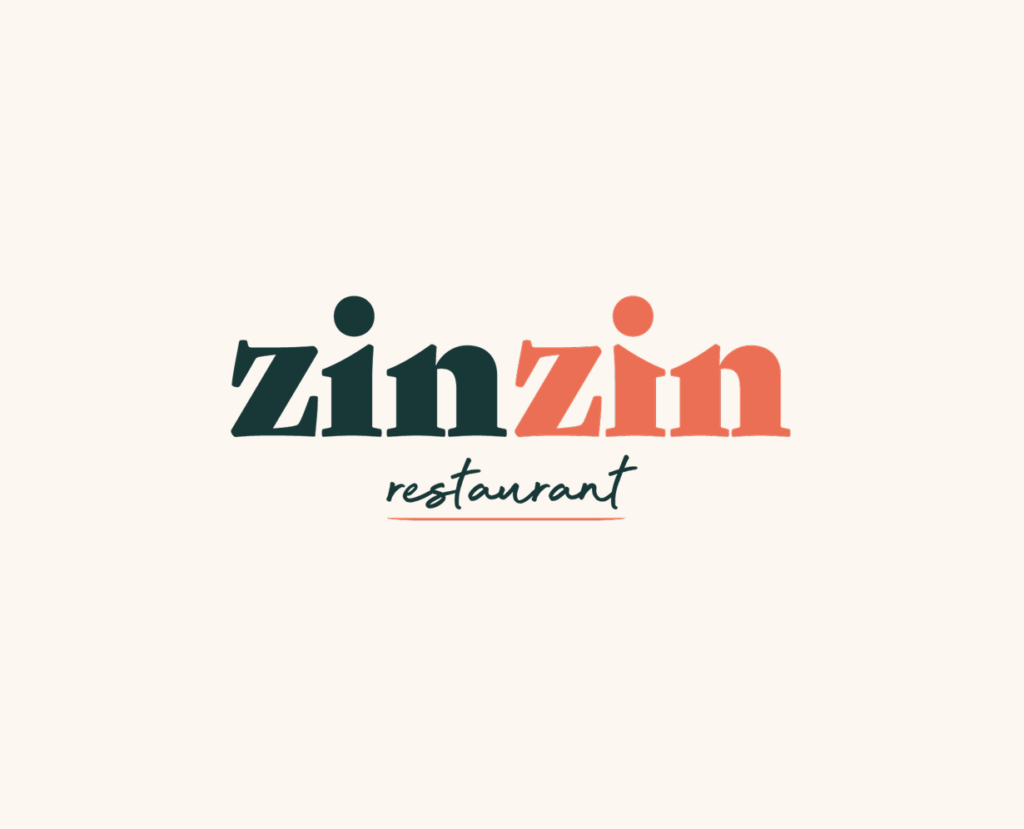
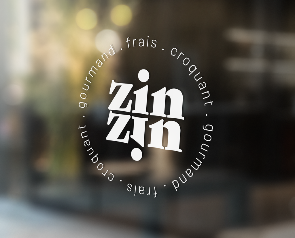
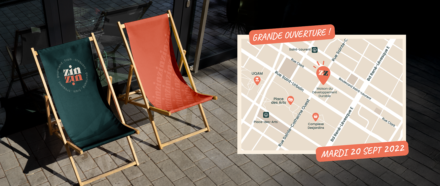
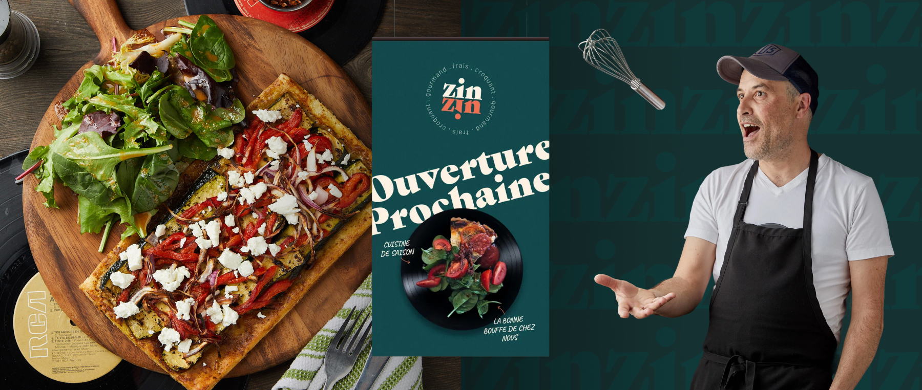
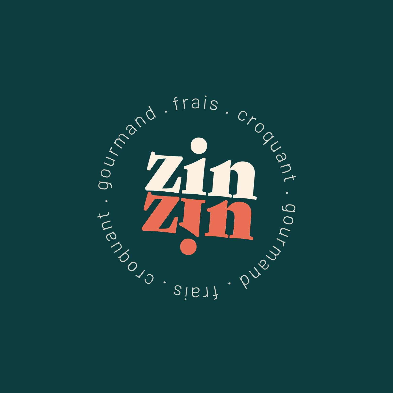
We worked from this retro and music-inspired heritage to create a cohesive visual system: a color palette inspired by the 60s and 70s, bold typography and a circular logo evoking vinyl records, movement and the vibrant energy of the venue.

The Objectives

Translate the restaurant’s retro and music-inspired universe into a strong, distinctive and instantly recognizable visual identity.

Develop more professional communication tools in order to better showcase the restaurant’s offerings and catering services.

Create a consistent brand experience across social media, menus and the various physical and digital touchpoints.
IMPLEMENTED
SOLUTIONS
We developed an approach combining branding, graphic design, asset production and content strategy in order to transform the restaurant’s existing atmosphere into a structured, recognizable and easily scalable brand universe.

BRANDING

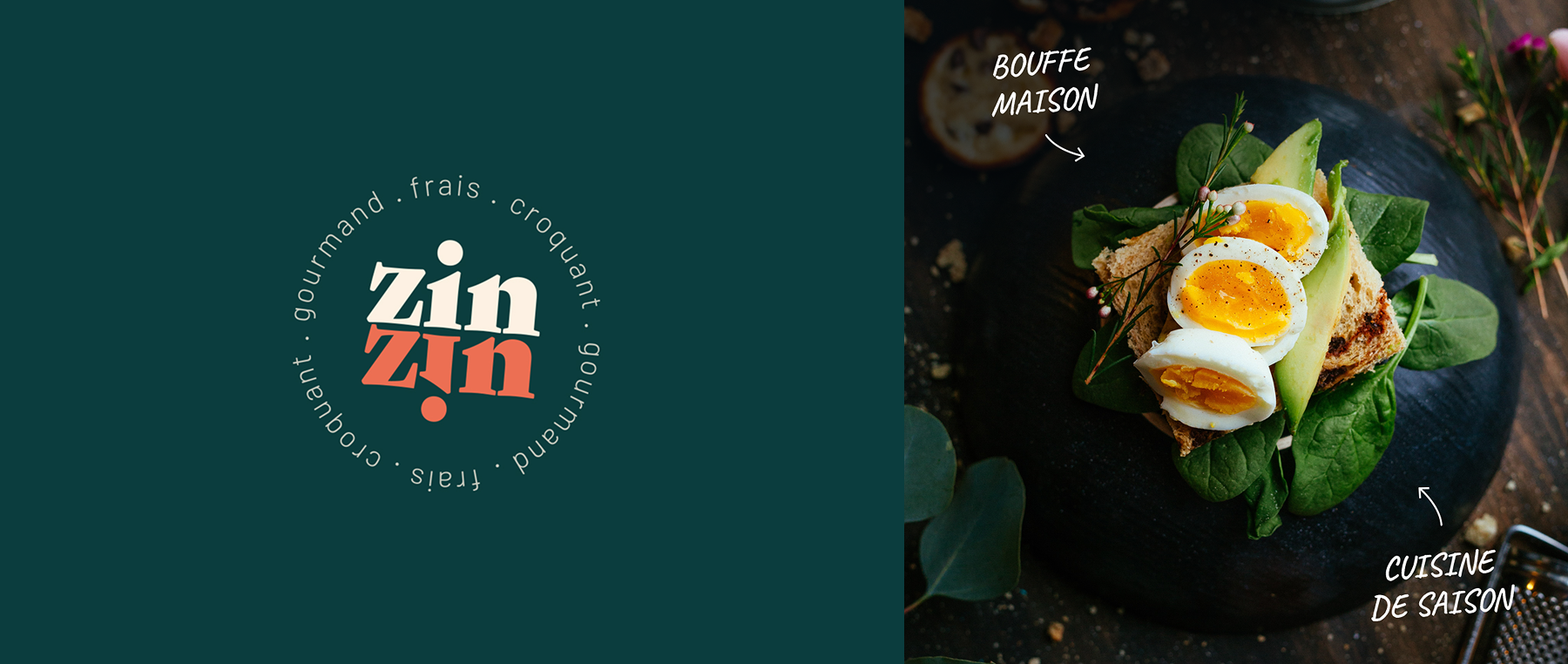
We developed Zinzin’s entire visual foundation based on the already strong atmosphere present within the restaurant. The objective was to transform this instinctive universe into a clear, cohesive and easily recognizable brand identity.

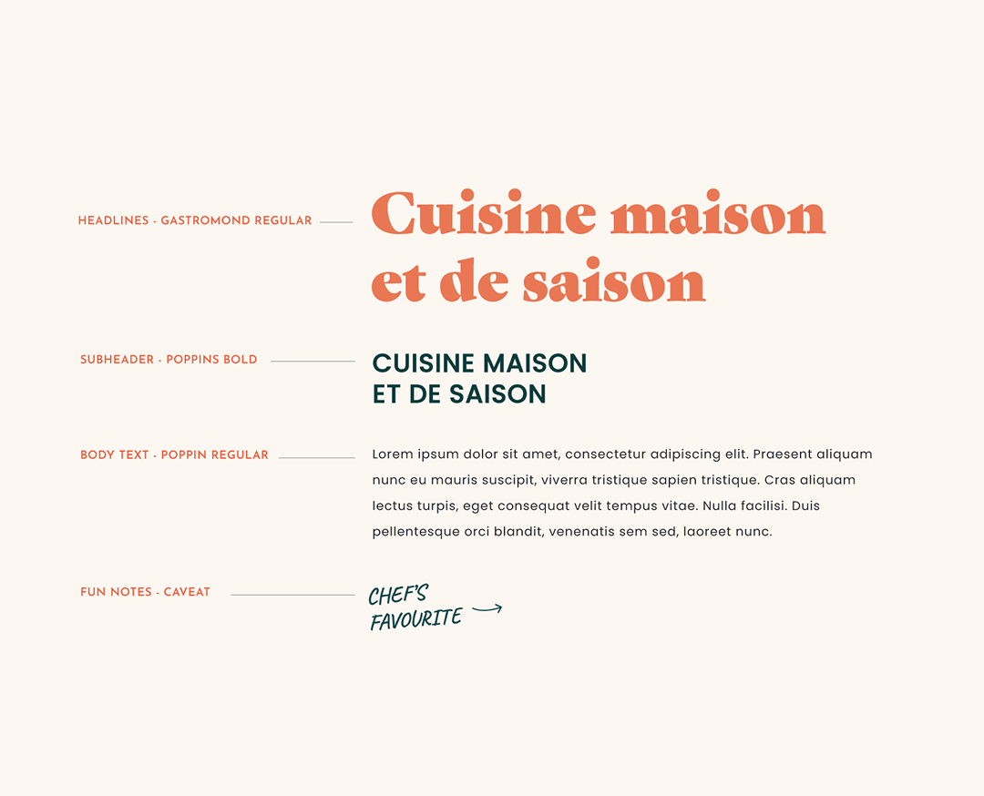
We designed the logo, color palette, typography and graphic elements by drawing direct inspiration from the venue’s retro and music-driven references, particularly the aesthetics of the 60s and 70s and the world of vinyl records. The goal was to preserve the restaurant’s warm, vibrant and slightly offbeat personality while creating a visual identity structured enough to live naturally across various physical and digital touchpoints without losing its authenticity.

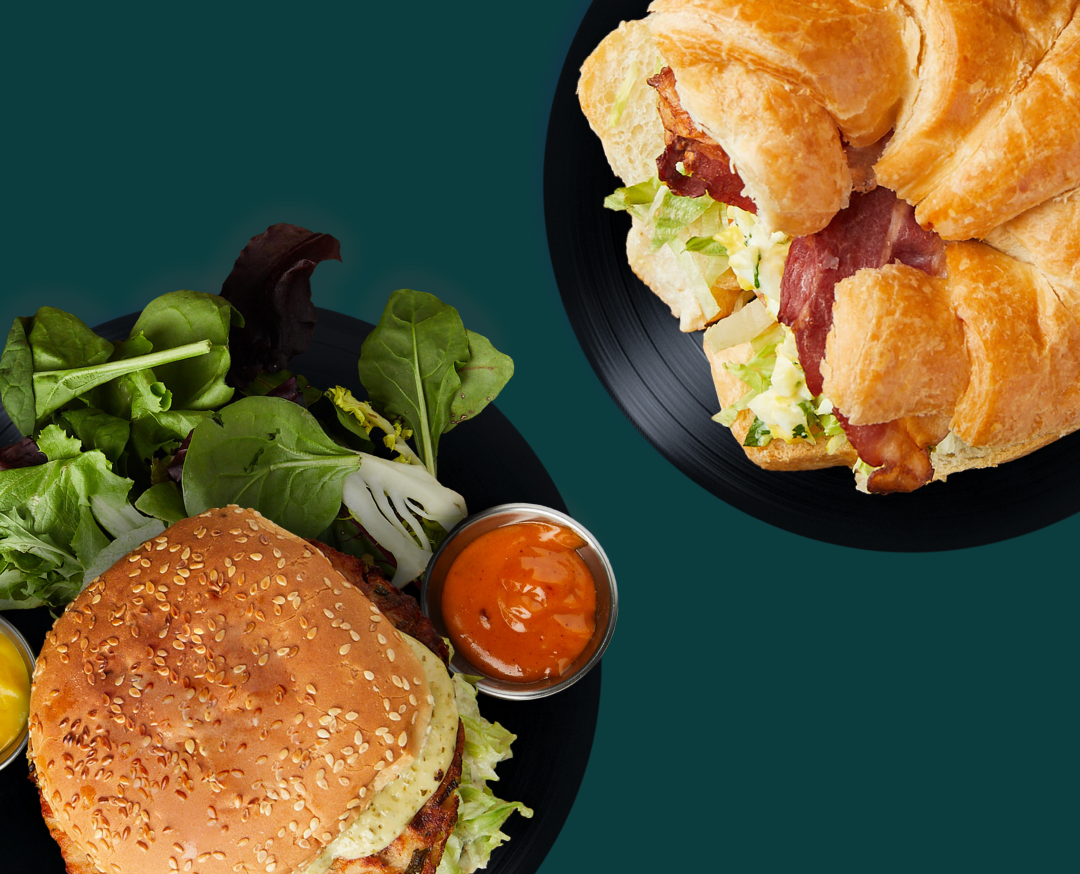
MEAL PRESENTATION ENHANCEMENT

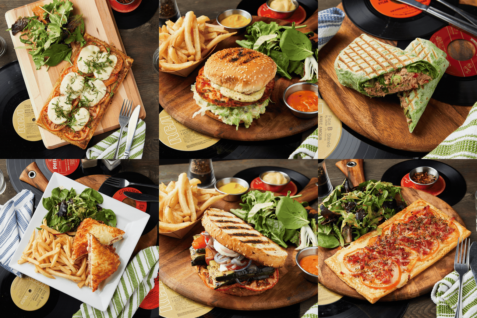
We carried out various visual retouching and treatment work in order to better showcase the restaurant’s dishes, textures and overall culinary universe. Particular attention was given to colors, lighting, framing and image composition in order to create visuals that feel more appetizing, warm and immersive.

The objective was to strengthen the visual appeal of the offering while preserving Zinzin’s retro, welcoming and slightly offbeat atmosphere. These visuals now allow the restaurant to present its dishes in a more cohesive and engaging way across its various promotional tools, menus and social media platforms.

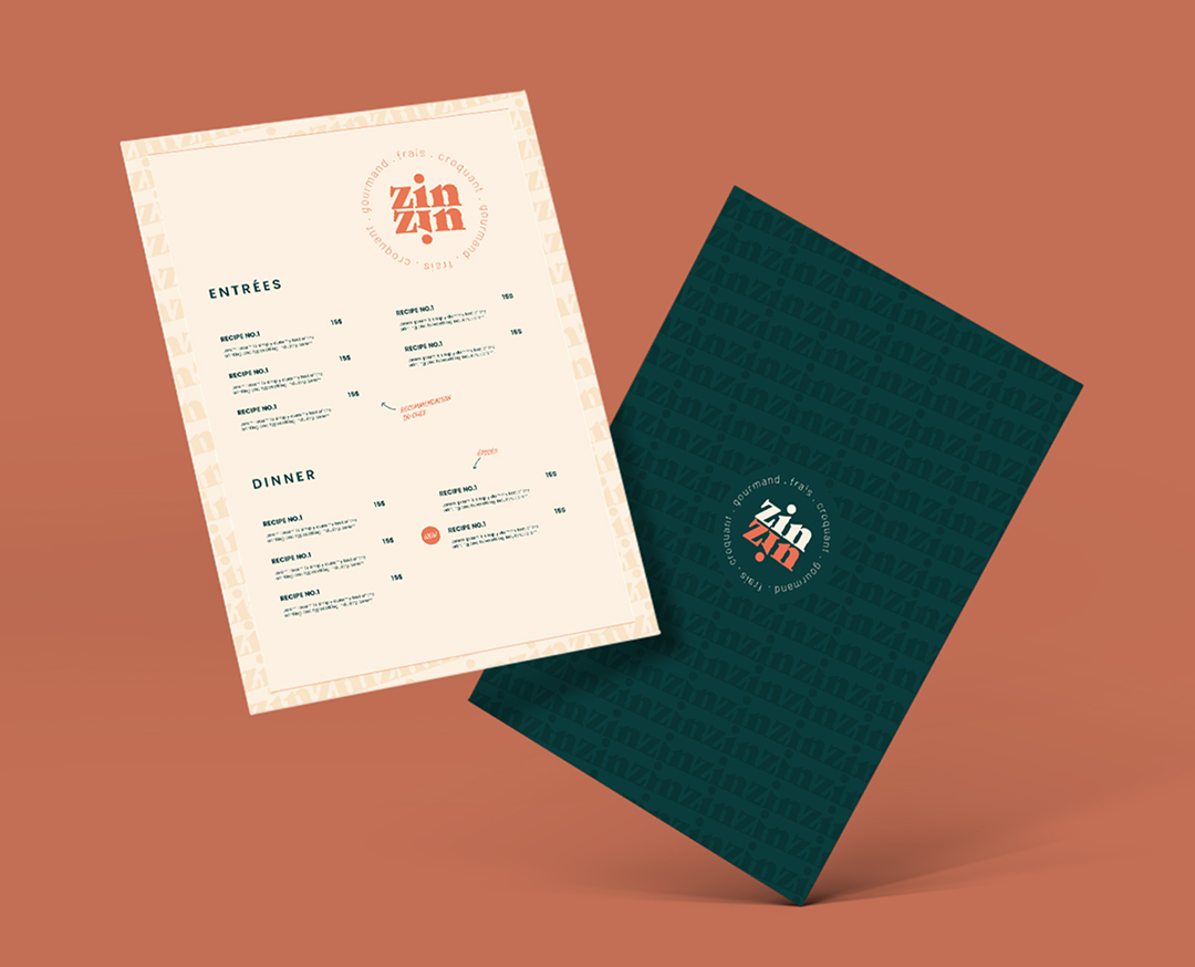
MENU & OTHER PHYSICAL MATERIALS

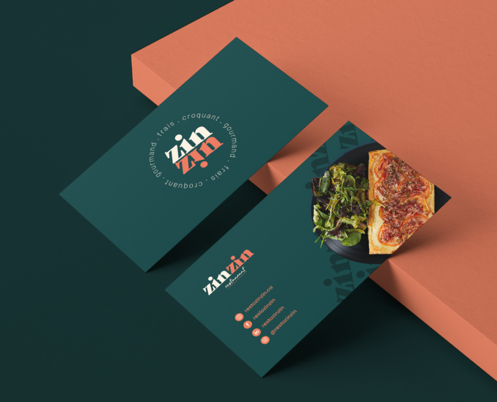
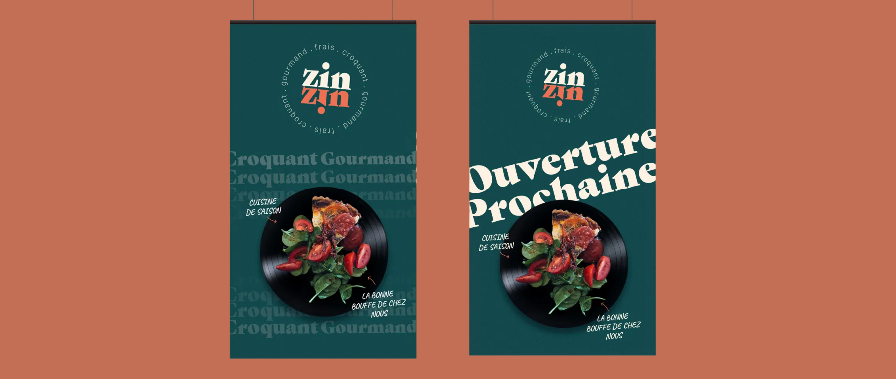
We designed various materials intended to support the restaurant experience on a daily basis, including the menu, business cards, promotional visuals and several graphic assets adapted to Zinzin’s specific needs.

Each element was created to extend the venue’s retro and music-inspired universe while ensuring a consistent brand experience across both physical and digital touchpoints. Particular attention was given to information hierarchy, readability and visual rhythm in order to create tools that are both functional and memorable while remaining aligned with the restaurant’s warm and distinctive personality.

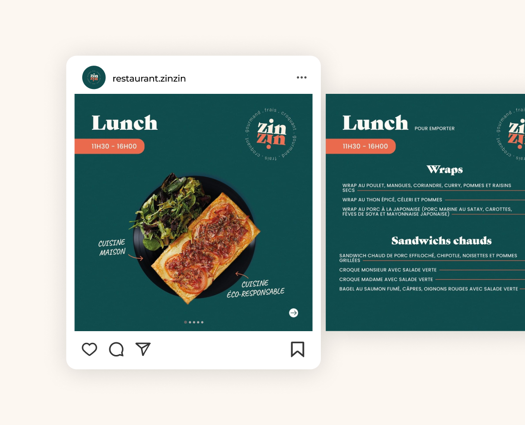
SOCIAL MEDIA CONTENT

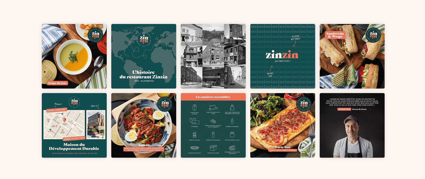
To support Zinzin’s digital presence, we developed a series of visual content pieces for social media directly inspired by the restaurant’s retro and music-driven universe. The publications incorporate the graphic codes defined within the brand identity: a vintage-inspired color palette, bold typography, dynamic compositions and visual references to the world of vinyl records and the aesthetics of the 60s and 70s.

Each piece of content was designed to highlight the atmosphere of the venue, the dishes, the events and the restaurant’s warm energy while creating a more cohesive and instantly recognizable presence across the different platforms. The intentionally vibrant, textured and expressive artistic direction allows Zinzin to extend its brand experience beyond the restaurant itself and maintain a stronger ongoing connection with its audience.

THE REsults

A strong brand identity

Zinzin now benefits from a distinctive visual universe directly inspired by its retro and music-driven atmosphere.

Professional communication tools

The menus, promotional visuals and social media content now allow the restaurant to present itself in a more professional and cohesive way.

A more recognizable social media presence

From the restaurant itself to its social media presence, every element now contributes to reinforcing Zinzin’s personality and brand recognition.